Perspective

I work as a self-employed designer, programmer and teacher in Berlin, interested in trans­forming data and infor­ma­tion into visual struc­tures while keeping a broad understanding of what a visualisation can be. I believe in a critical and theory-informed approach to data visualisation and design in general. I prefer to work with non-profit organisations, foundations, universities, journalists, and activists with open-source licenses.

Background

My recent works include long-term projects focused on the visualisation of climate change scenarios. With my background at the intersection of data visualisation and interface design, I have been involved in the concept, ideation and realisation of singular graphics to highly interactive, embedded visualsation systems.

Besides, I regularly teach data journalism and information design at the TU Dortmund and FH Potsdam. I’m also an affilitate at Metalab(at)Harvard. In non-Corona times, I co-organise the Data Visualisation Meetup in Berlin.

Selection of projects

I’m fortunate to have worked with many great clients like Metalab(at)Harvard, the Bill & Melinda Gates Foundation, the Simons Foundation, Deutsche Welle, Friedrich Ebert Stiftung and Zeit Online. Listed is a sample of these works from the last years. Find more on the projects page and subscribe to the RSS feed for updates.
Screenshot of the interface Science communication

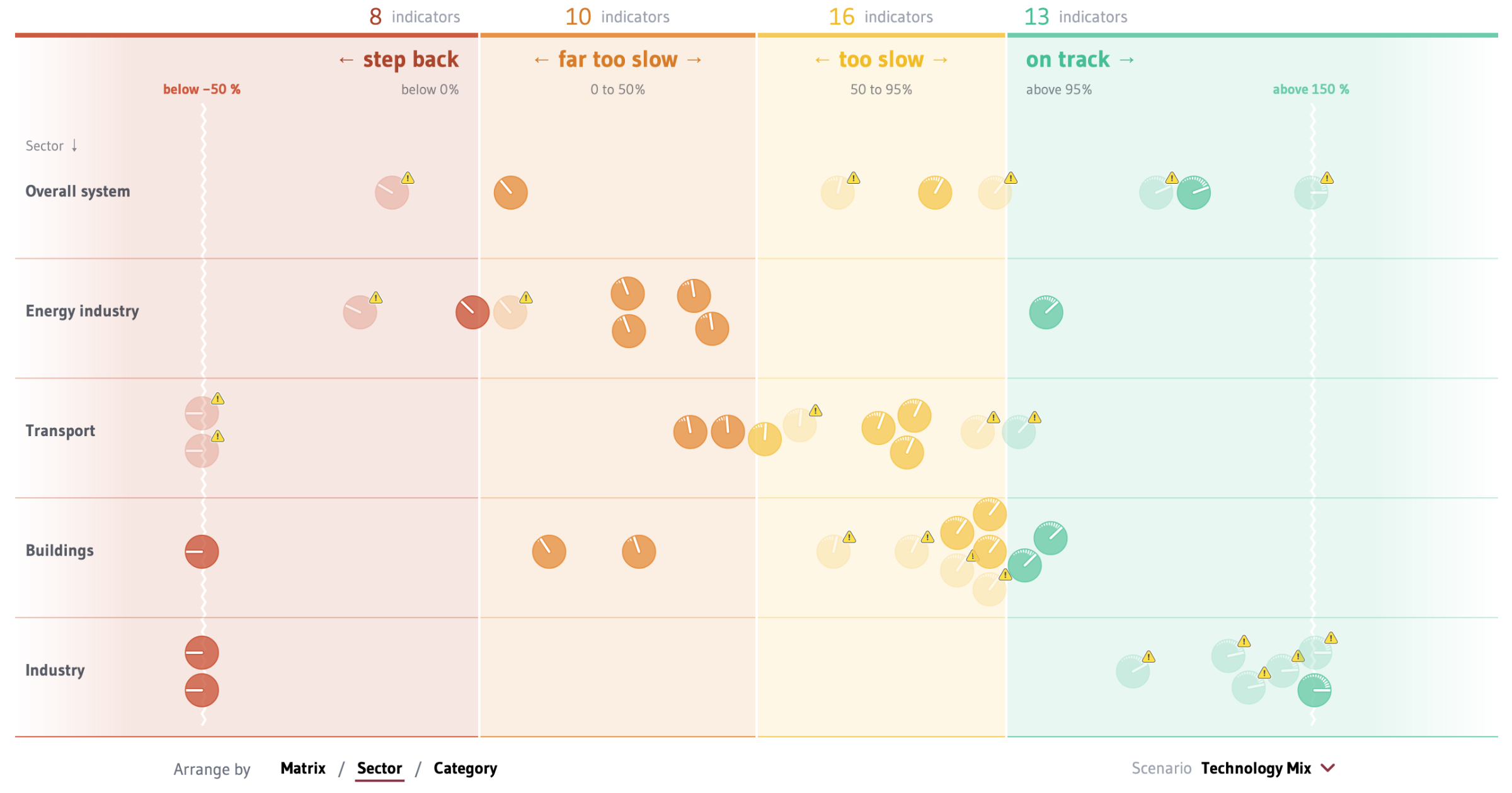
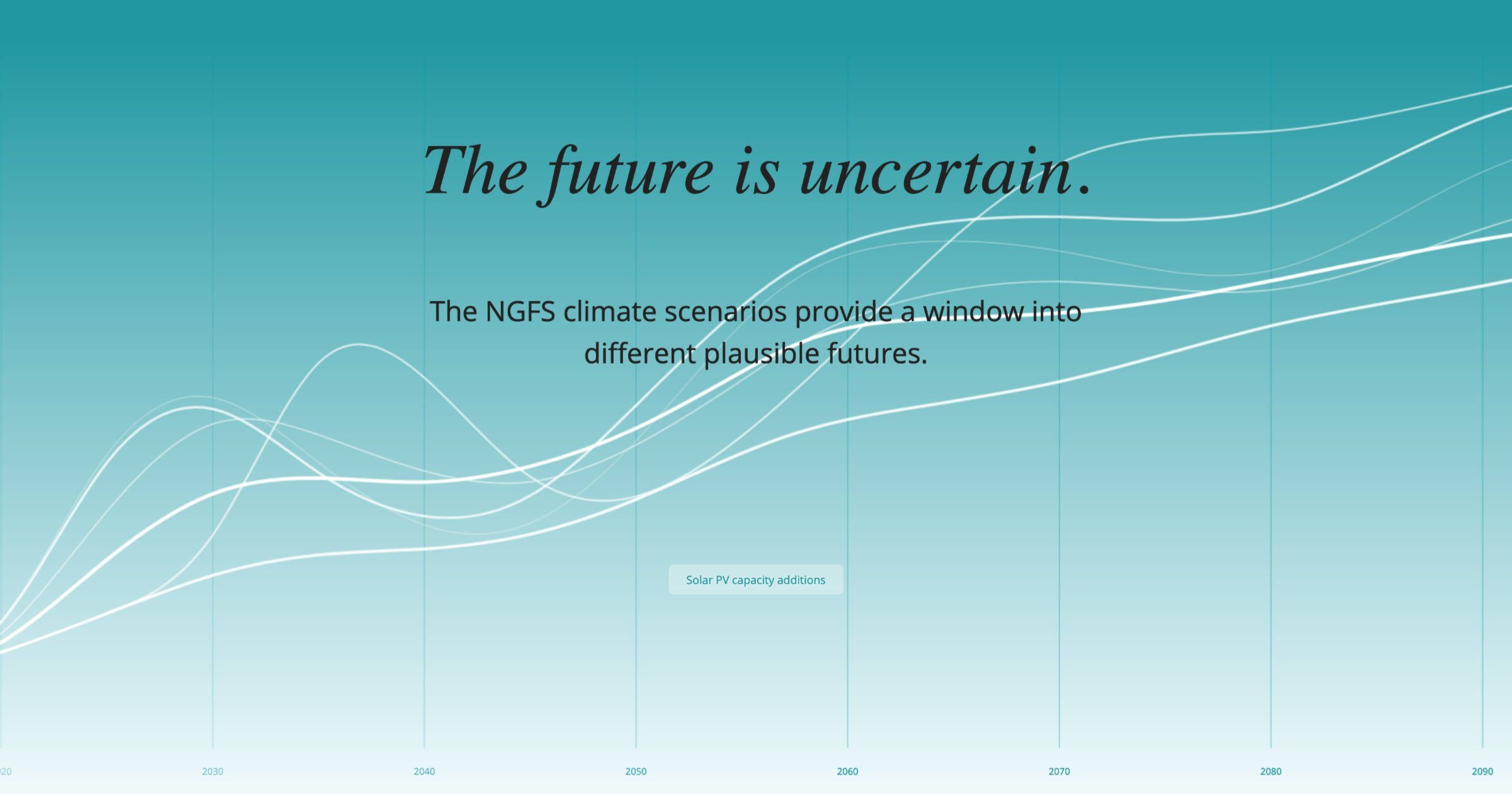
Greening the financial system

With countries targeting net-zero, the transitions pose significant risks. The NGFS scenario portal was created together with the PIK to explain and analyse plausible scenarios to central banks and supervisors.

See project
Screenshot of the interface Science communication

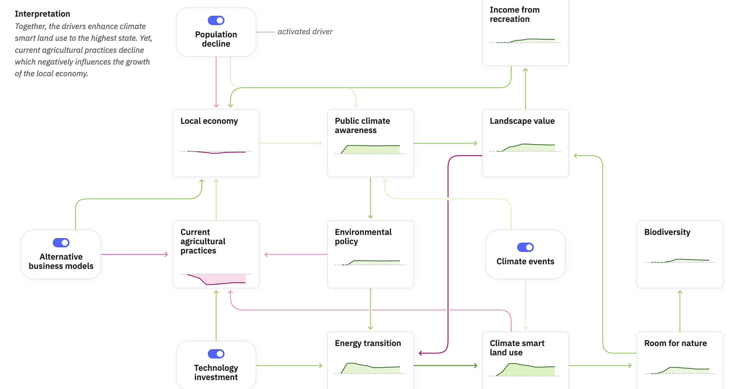
Communicating climate change scenarios

In this three-year project, we created modules that aim to make climate change scenarios understandable and more accessible. The international consortium consisted of scientists from PIK, IIASA, SEI, WUR and FH;P.

See project
Screenshot of the interface Science communication

How will I experience climate change?

Everyone is affected by the climate crisis differently. This web tool offers simple access to scientific data to find out differences in age, region and warming scenario.

See project
Screenshot 2022-11-22 at 16.08.40.jpg Interface design

Building a digital archive

The total redesign of the website allows structuring the ever growing activities of the Metalab(at)Harvard & FU Berlin

See project
Preview.jpg Science communication

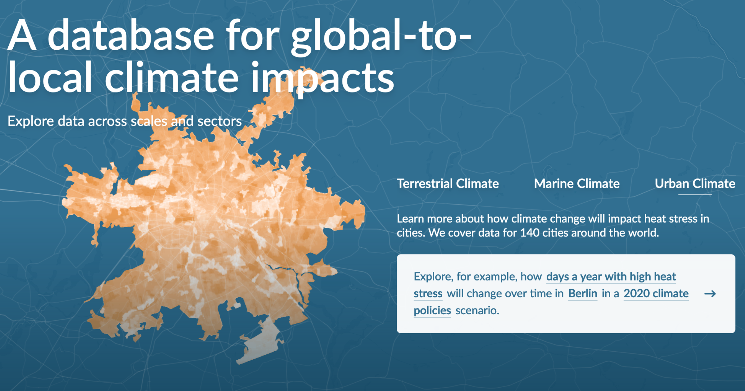
Making climate risks accessible

This ongoing project creates a dashboard that allow the exploration of climate risk scenarios.

See project

Notebook

Below, you find some notes that came to be in recent times. Subscribe to the RSS feed for updates.

OpenRefine Introduction

OpenRefine is a commonly used tool in data visualisation. This guide gives an overview of the main functionalities like inspecting data, clustering, merging and reformatting datasets.

Read note